Tuesday, October 11, 2011

BLUE DOG

Blue Dog Press-
Also the writers are working on a school digital newspaper and have asked us to design a logo and a banner for them. Here are some images that Knittel found to start us off:





Here is cute blue dog!!


Monday, October 3, 2011

Langley Fine art school New Logo!!

What we don't like:
  • Colours & Shapes=90s
  • Outdated
  • Font sizing of SCHOOL overrides Fine Arts.
  • Message is vagueNot all of the marks make sense
  • Looks like ketchup or blood
  • Looks like fire through a window
  • Leans to the right
  • Needs cleaning 
What we like:
  • Out of the box idea- exploding
  • Majors represented (but not all)
  • Like paint-like shape

Recommendations:
  • Unique
  • Bold/strong contrast/bright colors
  • Easy to draw
  • Be able to identify school with only logo
  • Needs to be simple & powerful
  • Movement
  • Keep basic essence of current logo
  • Maybe include motto: Explore, Create, Inspire


First


 Second


 Third


Fourth


Fourth 2nd


--->  I made Langley fine art school logo.
        Try to make simple. Because sometimes simple is powerful :)

       Which one do you like the most?


By Sooin Cho


Wednesday, September 28, 2011

Logo & Fonts


Logo Development
Before you further develop the LFAS logo, read through the following websites:

Logo Definition
In your blog, briefly define what a logo is.

How to Design a Logo
Then list and define the #2- 5 Principals of Effective logo design.
Compare the three logos and their effectiveness in section #3- Successes and Mistakes.

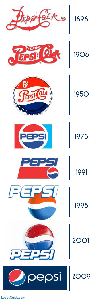
View the following links and take note particularily the note the evolution of Olympic logos. Notice how they continue to be simplified; the lines, shapes, colours are reduced to the most simple possible. Logos are like poetry, they say the most with the least amount of marks made.


There are lots of logo
and they are all different and unique!

Tuesday, September 27, 2011

9-Fonts

Fonts are a complete assortment of type of one style and size. Fonts are expressive, they have personality and are a powerful communication tool. Letter styles are very important in design. They are an identifier of a company, an organization, an event, a band, style of clothing, or tv show... Font styles are so powerful, they can control the way we think and perceive about something.

Typography is the art and technique of arranging type, type design, and modifying type glyphs. The arrangement of type involves the selection of typefaces, point size, line length, leading (line spacing), adjusting the spaces between groups of letters (tracking) and adjusting the space between pairs of letters (kerning).

We are going to explore the power of font choice and various applications of typography in design


9 different fonts
They all have different character like our personality:)

Tuesday, September 20, 2011

Friday, September 16, 2011